Genealogy applications and software have gotten a little boring lately. With all the fascinating technologies surrounding data visualization, machine learning, and otherwise, most people choose the path of least resistance and hand their data over to Ancestry.com. And while Ancestry has some interesting visualizations for family trees and relationships, the closed-platform nature of it pretty much places users at the mercy of whatever Ancestry’s engineers think is a compelling way to display data.
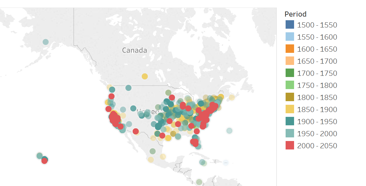
I’ve been watching applications on Tableau’s public site for some time, and really like the free visualization tools it provides for experimenting and sharing. My first try at visualizing family data with Tableau is to track the growth and migration of my family lines over the past ~500 years. It’s a pretty straightforward set of inputs: Births, deaths, and other life events along with their locations in longitude and latitude.
You can see the results below, or on the Tableau site. It shows the growth and migration of family lines from 16th century England to around the world today. For simplicity, I’ve not added a filter to look by surname, but that may be a future enhancement.
